           My quest for the perfect GTD (Getting Things Done) system has been on-going for a number of years. Of course, what is “perfect” for me at any given time has varied based on my individual needs at the time, and the system that works best for you will need to be tailored to your own needs for task management. As defined, the “getting things done” methodology basically “rests on the idea of moving planned tasks and projects out of the mind by recording them externally and then breaking them into actionable work items. This allows one to focus attention on taking action on tasks, instead of on recalling them.” (Wikipedia) Back in the early 2000’s, I started (as I suppose most did at that time, before smartphones) with a paper-based project checklist and daily assignments of tasks from it. Some may still use a paper-based system, but in the post-paper and post-PC era, many are turning to mobile devices for time management, as they always have their trusty iPhone or iPad at their side to keep them on task and available.
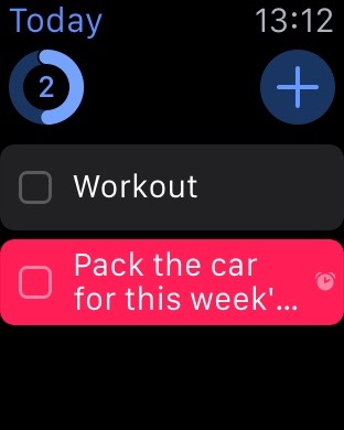
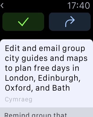
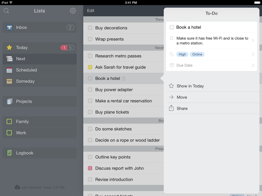
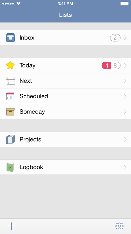
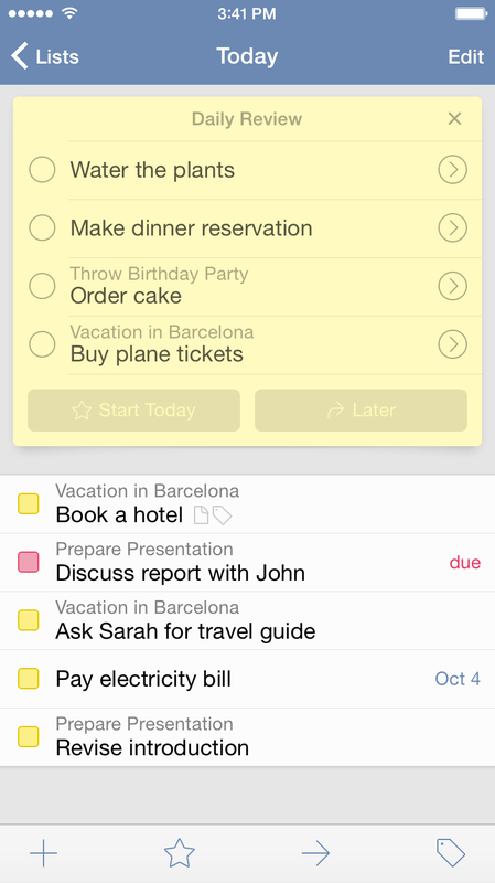
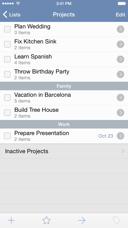
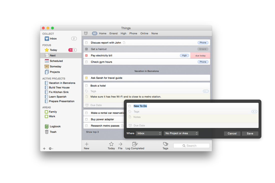
In our era, with our multiple devices and a plethora of software options, we are fortunate to have the means of figuring out a way to keep on top of things, and increase our productivity. With the advent of the Apple Watch, now, we have another device as well, that can boost our potential for tracking and doing things. And, with the release of one of the first to-do apps for the Apple Watch, Things, I think I have found the software that best matches my philosophy and workflow, along with a little bit of “gamification” of task completion, designed along the lines of the Apple Watch’s own fitness goal gamification. I believe I have finally found the system that truly “just works” across my entire device line-up (MacBook Pro, iPad Air 2, iPhone 5S, and Apple Watch), with effortless instant sync and now with Siri integration on the Watch, the ability to add a to-do item by very simple dictation within a second or two, as I think of it, without even the need to pull my phone from my pocket. Things shines above the competition in a number of ways. Its interface is super easy to learn, and it took only a few minutes to get acquainted with Things’ way of doing things. The interface looks similar enough between the various platforms, including the Watch, so there is only one very minimal learning curve. Things offers several distinct staging areas for your to-dos, based on your initial assessment of where they belong, with it being very simple to reassign things later. The Inbox is where all new to-dos are entered, and this can be either through dictation on the Watch, entry on iOS or Mac, or importing from Apple’s Reminders app via Siri. Once your things are in the Inbox, a quick triage gets them into either Today, for immediate attention, or one of the other lists, such as Next, for something less than immediate but more immediate than just “whenever I get around to it.” After that comes Scheduled, for activities that come with a specified date; then Someday, whose icon even looks like a little storage box, to keep reminders to do things that you want to eventually do when you’ve got nothing else clamoring for your attention and time. Additionally, there is an interface for Projects, which is used to track goals which have multiple steps and perhaps multiple due dates along the way. Things comes with the ability to assign contexts as well, called Areas, and tags, which can be one or several descriptive terms, such as maybe a description of how long the item is expected to take, perhaps a name of to whom it pertains, or a location for where it is to be done. Searching and sorting can be done by Areas and Tags. Each new day, Things presents for your review those items you have designated as being scheduled for that date. You can either accept them and place them into the Today box, or delay them until any specified time in the future. What's really neat is that even the Apple Watch app for Things allows you to do this, as well as to move newly dictated tasks from the Inbox right into Today with a single tap. When a task is completed, you have the option to log it, which adds the completed item to the Logbook, a running list of archived completed tasks (perhaps to review when you have completed everything and want to reminisce about how productive you’ve been). Things includes—at no extra cost—a built in cloud sync service that is remarkably fast. A lot of apps rely on kludgy Dropbox integration or the like in order to sync between devices, which results in errors frequently. I have lost count of how many times I’ve had to reset the sync on other to-do apps, which is time wasted and always worries me about lost task entries. I have been nothing but pleased with Things’ cloud sync service and recommend it without any hesitation. You might look at the cost of the various Things apps and balk at paying for two or three different apps, but remember that unlike other to-do apps, there is no monthly or annual fee to keep syncing tasks between devices: once you buy the apps, they are yours for keeps. I’ve found Things to be very user-friendly, and over the past four weeks of usage, I have yet to find anything to be disappointed about. I’ve not been able to say that about every to-do app I’ve tried. By this far into using most to-do software, I’ve usually come across shortcomings or frustrations about user interface issues. So far, I’ve been nothing but pleased with Things. The apps are fast, very responsive, and each utilizes the best features of their respective platforms’ interfaces. The Mac app allows you to quickly and easily drag and drop tasks between Areas and Focus lists as well as ordering them within same. On the Mac, a little alarm clock icon near the top of the Things interface lets you quickly see which tasks you have with assigned due dates, anywhere in your Focus lists and Areas. On iOS, the more limited screen space of the iPhone is well utilized, and the iPad app also makes good use of its own screen space. I’ve often been disappointed with apps whose iPad version is little more than a blown-up version of the phone app, or which does not play to the strengths of the iPad screen size and interface. Things has been designed well and benefits from apparent attention to detail throughout. It is fully compatible with Handoff between iPhone and Mac apps, as well. The Mac and iOS apps have their own Notification Center widgets also, bringing even tighter integration to the system. After a month of use, I’ve become totally invested in Things and have moved all my projects into it. The Apple Watch integration has really wowed me. Other to-do apps are promising Apple Watch apps as well, and it will be interesting to see how those pan out. But Things was first to the party and even so, did a great job and the Apple Watch app does not appear to be a rush-job as many other Apple Watch apps seem to be. A lot of care and attention has gone into the Things app ecosystem. I also like how the software is broken into separate apps and thus separate charges for the apps per platform. Sometimes it can get expensive to pay for the combined costs of an iPad and iPhone app if all you’ve got is one or the other. Things is available on each platform, iPhone, iPad, and Mac; links below. The only good to-do app, and indeed the only good Getting Things Done system, is one that you will actually use on a daily basis. In order to be that sort of system, it has to be unobtrusive, not a time waster, and generally pleasing to use, not a chore. Things succeeds on all counts. iPhone/Apple Watch ($9.99) iPad ($19.99) Mac ($49.99):
0 Comments
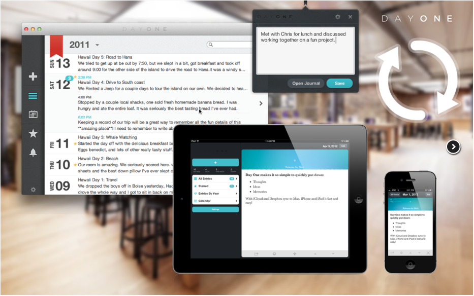
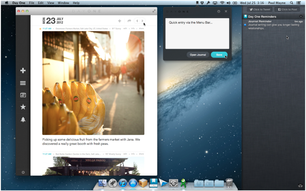
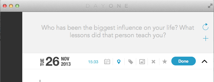
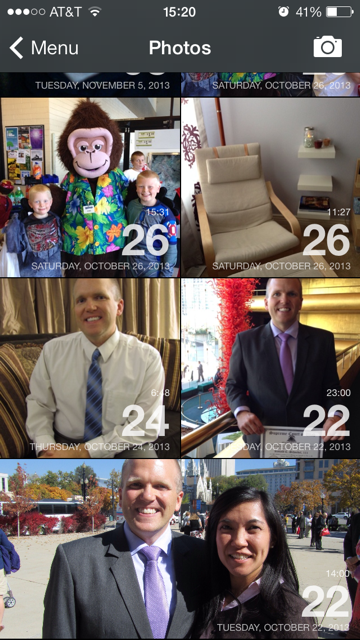
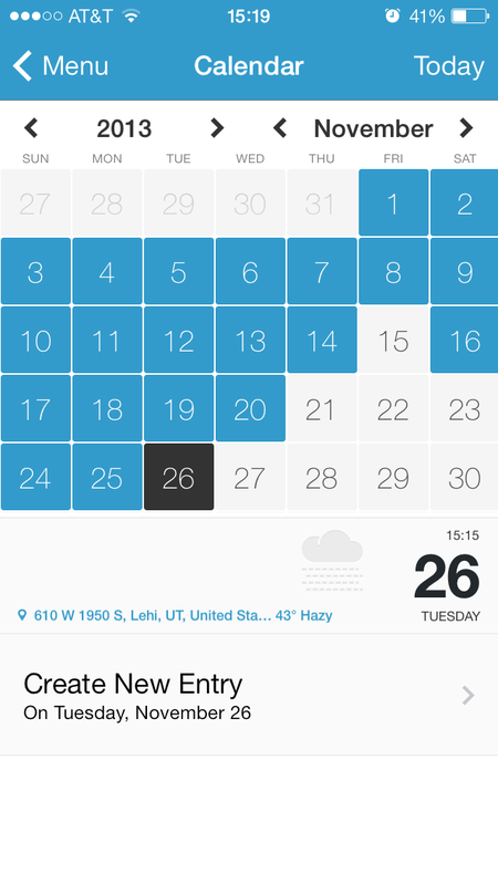
 Whether your journaling needs are driven by professional requirements or personal uses, Day One has a cross-platform journaling/diary-keeping solution that is convenient, elegant, and easy to use. Day One provided me copies of their Mac and iPad apps for review. For the past three weeks, I’ve been journaling daily–sometimes more than once a day–and have found the experience to be pretty much all I’ve wanted in a journaling app. It’s no wonder to me that Day One was a Mac App Store top app last year. Available both for Mac OS X (updated for Mavericks) and iOS (updated for iOS 7) as a universal iPhone/iPad app, Day One combines a solid writing environment with data tools to give your writing context. Starting an entry automatically date and time stamps it, though this can be edited to be whatever you want it to be. Location and weather data can be added with a single tap, as can be tags, current iTunes track, and for devices with the new motion processor, daily step count, and activity tracking such as whether you were flying, running, or doing other activities. The distraction-free writing environment lets you get down to business, without tons of formatting palettes and toolbars that make writing in a regular word processor somewhat less than optimal for capturing your free-flowing thoughts. The main view shows a snippet of each entry in reverse time order, from top to bottom, newest posts on top. Hovering over the entry lets you see more of the entry without opening it fully. The integrated calendar shows you at a glance the days on which you have journaled, and the days for which you might still need to write an entry. Hovering over a date shows you what you wrote on that date. On iOS devices, the photo view arranges all your entries with attached photos into a full-screen collage with the date of each photo superimposed, for quick reference and enjoyment. On Mac, the maps view allows you to see how many entries you’ve written at each map location you’ve captured in your entries. This could be fun for journaling whilst on holiday, to track your travels visually. The interface as a whole is uncluttered and visually pleasing, in comforting tones of blue, grey, and white. The Mac app contains the option to show writing prompts, useful for those who journal regularly and like to record their thoughts on a wide variety of subjects. For professional users, tags and the built-in search tool make Day One a useful repository for client-specific note taking or project note keeping. Attorneys, for example, could assign tags for client names or types of cases, and easily keep track of the results of meetings and phone calls with clients. The time stamp on note creation can be useful to those who bill their time out, though there is no ending time stamp, so that would have to be noted manually if this were to be your usage scenario. In my three weeks of using Day One, I have found it to sync perfectly across my devices, which has made me more likely to actually keep a journal, something I have tried to do off and on (mostly off) for years. The ability to set a daily reminder to journal is nice for keeping me on target, as is the quick entry feature on the Mac version, which places a Day One icon in the menu bar where you can quickly type an entry (or just a brief thought to finish later) without even launching the full app. Like so many things that my iPhone and iPad have made easier in my life, being able to write (or dictate!) a journal entry whenever and wherever I am when the inspiration arises has been a tremendous boon to my journal-keeping goals. The seamless set-it-and-forget-it iCloud and Dropbox syncing capability makes this possible. I especially enjoy that Day One has given me the ability to remember my random iPhone snapshots in context and make notes on them for future enjoyment. Too often, the casual ability to take photos with our phones results in lots of pics with not a lot of context or remembrance of why they were meaningful to us to begin with. Being able to incorporate those pics quickly and easily into a journal may be the best thing to ever happen to the camera phone. Exporting from Day One to a PDF is also smooth and easy. Perhaps each year you might want to print and bind your journal, and Day One makes this a snap. Emailing a PDF or the text of any entry is also very simple right from within the app, using the standard iOS sharing tools. Suggestions: color-coding entries would be a nice addition, sort of like the colored tags (formerly labels) in Mac OS X. For professional users or individuals who need more privacy, the built-in passcode protection on the Mac app can be gotten around by all but the most casual would-be snoopers. Of course, anytime a third party has physical access to your computer, your data is at some risk of being compromised. But it would be nice if a true encryption option existed rather than app-level password protection, which just prevents the app from being launched without the passcode, while leaving the actual text data files still accessible to those who can find them. For most users, though, the user-account password in OS X should suffice, because theoretically if you don’t want someone accessing your data, you probably don’t want them in your user account to begin with. Also, whilst a single journal entry can be viewed on the map on iOS, the Mac-only map overview of all entries would be nice to see on the iOS app as well. Get the apps here: Day One for Mac $9.99 Day One for iOS (combined iPad/iPhone app) $4.99 - Review by Ronald Schoedel, Esq. By Ronald C Schoedel III  Calendars 5 is the latest iPhone and iPad calendar app from Readdle, the same folks who brought us PDF Expert, which I recently reviewed here on iLegalPad.com. Calendars 5 is a universal app, meaning it works on both iPad and iPhone, with just one purchase ($6.99 on the App Store). I used Calendars 5 on both my iPhone and my iPad for a few weeks and what impresses me overall is the attention to detail paid by Calendar 5’s designers, who have added subtle touches that make it intuitive and easy to use, in all of its various views and on both types of devices, as well as its integration of tasks and appointments into one application. Calendars 5 works with iCloud and Google calendars, and works just fine with the five calendars I synced with it. Of course, you can choose to display or hide calendars on an as needed basis. Calendars 5 makes very good use of the iPhone 5 screen area, and offers a list view of your daily appointments something like the iOS Calendar app used to offer until iOS 7’s redesign. Lots of folk I know loved the list view; with Calendars 5, you can have it back, and in a visually intuitive form that shows color coding for each event to match the calendar, as well as a “slider” at the bottom of the scree showing your position in the current week, for reference. Daily, weekly, and monthly views provide detail and bird-eye views of your calendar, as needed. Whilst the iPhone version provides a number of advantages over the native iOS 7 calendar app (some of which will be mentioned shortly), my favorite iteration of Calendars 5 is on the iPad, where it really has room to shine thanks to the large screen format. I love the day view, which shows a rolling list along the left side, and the hourly calendar on the right, along with the current time displayed as a line across the timeline. Individual events show the scheduled time (e.g., under my event entitled “Work”, the blue event box also shows the times scheduled, 8:00 - 17:00). Recurring events display a small circular arrow within the event box, providing an immediate visual cue. A date slider along the bottom of the screen shows two weeks worth of dates between which you slide. On the iPhone, the list and day views are separate due to the limited screen area. The week view on both the iPad and the iPhone cleverly indicate that events are scheduled before or after the actively visible screen area with little arrow icons in the color of the calendar on which events are scheduled, to make sure you don’t overlook something that is scheduled later in the day. In the same manner as the day view, the week view has a slider across the bottom through which you can scroll through the weeks and choose which one to view. Ditto for the month and year views. The month view looks fairly similar to the native iOS app, but the year view shows each day color coded as to how busy it is: white for days with nothing scheduled, yellow, orange, and red for progressively busier days. This is great to get a bird’s eye view of the year and see when you’re booked out, at a glance. My absolutely favorite feature is the natural language input method employed (optional to use). Don’t get me wrong: I think the sliders and wheel metaphors in iOS are great and handy and all. But sometimes it’s easier to just type “Meet Jim at Paradise Bakery tomorrow at 13:00” and have it automatically know the date, time, and location, as well as the title of the event. If you’re a fast typist, this may be the easiest way to add an event to the calendar--much the way that advanced typists can do with their keyboard using shortcuts a task for which many would prefer a mouse. Of course, dictation (on those devices supporting it) works as well, so you can just speak your event into existence. The task list integrates with iCloud’s Reminders, so you can stay synced between your iDevices and your Mac’s Reminder list. The primary advantage is that both tasks and calendar events show up in one app, giving you an idea of how busy your day is, when you’ve got due dates assigned to your reminders or tasks. Other intuitive features include drag and drop for events and tasks, the ability to send SMS reminders and custom alerts for events. Event invitations can be sent from within Calendars 5 as well. Calendars 5 has a nice, iOS 7-inspired design that looks sharp and crisp. I am a fan and enjoy using it daily. You will too. Get it here: Calendars 5 for iPhone and iPad by Readdle 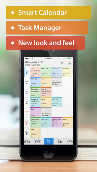  Copy.com is one of the latest entrants to the increasingly competitive consumer-oriented cloud data storage market. If you are familiar with Dropbox, you will be instantly familiar with Copy. I've been a Dropbox user for a few years now, and have also been a very happy Copy user, for the past several months. I use both services, each for different purposes, and I submit that even if you have a Dropbox account, you, too might find a place in your workflow for Copy.com. Copy combines a web interface, an iOS app, and a Mac app (as well as Linux, Android, and Windows versions) to make all of your stored documents available across any device you might have access to at any given time. I am using Copy to make files from my Documents, Downloads, and Desktop folders on my Mac available to me anytime on my iPhone and iPad, as long as I have internet access. This has proven quite useful when I am away from my computer, on the phone with someone whilst I am out and about, and I want to refer to a document for some information. I simply pull up the Copy app on my iOS device, navigate my folder structure which mirrors that on my Mac, and download the file. The Copy app has a built-in file viewer so I can read most any sort of file. Pages, Numbers, text files, Word, Excel, PDF, images, and others are all readable within the app. For other sorts of files, the "Open in..." function allows you to send your document to other apps on your iPad or iPhone. Among the other useful features of Copy are its Shared folder, which allows files to be shared amongst Copy users for collaboration or multiple user access, the ability to restore files from multiple previous versions (I counted at least 20 prior versions available to me when I accidentally deleted a file the other day), and significantly better pricing than Dropbox: your first 15 GB are free, compared to Dropbox, which gives you 2 GB free. Use this link, and get an extra 5 GB free after you sign up and install the Copy app on at least one device. Whether you're looking for backup in the cloud, or file syncing across devices, Copy is a compelling new service that will give Dropbox, SkyDrive, and Google Drive a run for their money. Get it here: Copy.com Review by Ronald C. Schoedel III, Esq. 
|
AuthorRonald C. Schoedel III is an attorney, former broadcaster, student of Welsh, and Sinophile. He has lived in Alaska, Wales, and China (Hong Kong specifically), and presently calls Utah home. He has been teaching and training Mac users for nearly a decade, and started blogging as a software reviewer in 2004. Archives
September 2015
Categories
All
|
 RSS Feed
