|
This fall is an exceptional time to be an Apple-using attorney or an Apple-using anybody. So many new time-saving and productivity-enhancing features have been built into the new versions of all of Apple's operating systems. And with the release of the iPhone 6s and 6s+, Apple has upped its game on truly mobile photography as well. In this post, I'll share a couple great new features on the wrist and on the desktop. I'll touch on iOS 9 more once I receive my new iPhone 6s, soon. So far, on the Apple Watch, I'm loving the Time Travel feature. With a quick turn of the digital crown, I can see my calendar events, the weather, and other dynamic elements on my watch face change to match whatever time I am scrolling to. It's a super fast and super convenient way to take a quick look at the day ahead. 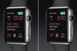 In El Capitan, Apple's newest desktop OS for Macs, two standout features have increased my productivity: new Spotlight search and Split View. Split view takes two windows and makes them exactly half the size of your screen, and places them right next to each other. This has always been possible, of course, by manually resizing windows, but this new feature just makes it quicker and easier without fiddling with resizing window borders individually. Spotlight search now shows many more results, including from the Web, Wikipedia, weather forecasts, as well as responding to natural language search terms, such as "Emails from Harold". A system-wide (and beyond) search means less time spent thinking of where would be the best place to search for something: in your email folders, on the web, in documents you've already created or downloaded, or so forth. watchOS 2 is now available for updating via your iPhone's Apple Watch app. El Capitan is presently only in beta form, but will "soon" be available on the Mac App Store (likely in the next few weeks at most). 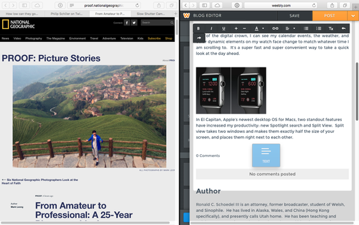
0 Comments
           My quest for the perfect GTD (Getting Things Done) system has been on-going for a number of years. Of course, what is “perfect” for me at any given time has varied based on my individual needs at the time, and the system that works best for you will need to be tailored to your own needs for task management. As defined, the “getting things done” methodology basically “rests on the idea of moving planned tasks and projects out of the mind by recording them externally and then breaking them into actionable work items. This allows one to focus attention on taking action on tasks, instead of on recalling them.” (Wikipedia) Back in the early 2000’s, I started (as I suppose most did at that time, before smartphones) with a paper-based project checklist and daily assignments of tasks from it. Some may still use a paper-based system, but in the post-paper and post-PC era, many are turning to mobile devices for time management, as they always have their trusty iPhone or iPad at their side to keep them on task and available.
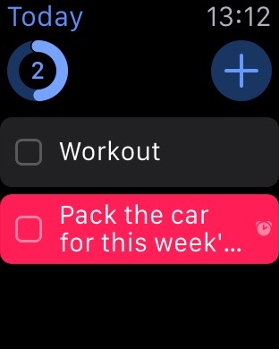
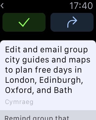
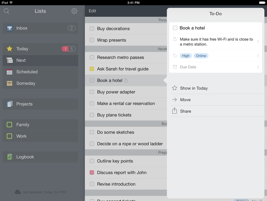
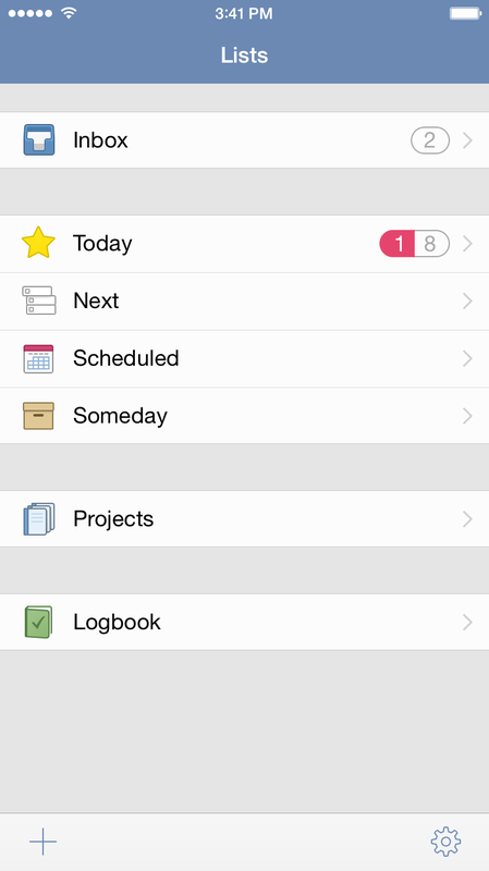
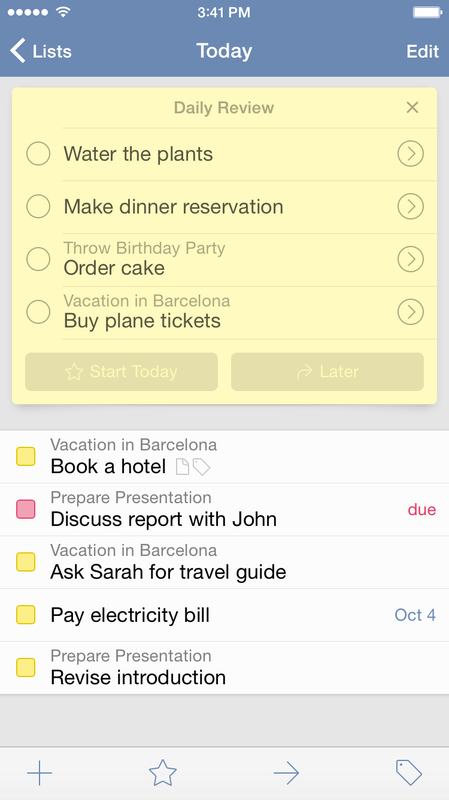
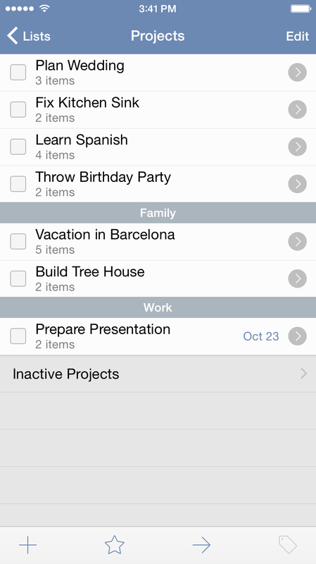
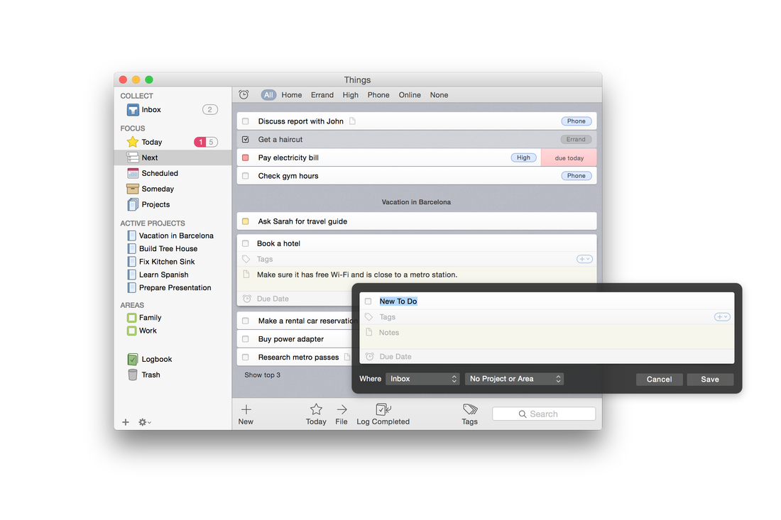
In our era, with our multiple devices and a plethora of software options, we are fortunate to have the means of figuring out a way to keep on top of things, and increase our productivity. With the advent of the Apple Watch, now, we have another device as well, that can boost our potential for tracking and doing things. And, with the release of one of the first to-do apps for the Apple Watch, Things, I think I have found the software that best matches my philosophy and workflow, along with a little bit of “gamification” of task completion, designed along the lines of the Apple Watch’s own fitness goal gamification. I believe I have finally found the system that truly “just works” across my entire device line-up (MacBook Pro, iPad Air 2, iPhone 5S, and Apple Watch), with effortless instant sync and now with Siri integration on the Watch, the ability to add a to-do item by very simple dictation within a second or two, as I think of it, without even the need to pull my phone from my pocket. Things shines above the competition in a number of ways. Its interface is super easy to learn, and it took only a few minutes to get acquainted with Things’ way of doing things. The interface looks similar enough between the various platforms, including the Watch, so there is only one very minimal learning curve. Things offers several distinct staging areas for your to-dos, based on your initial assessment of where they belong, with it being very simple to reassign things later. The Inbox is where all new to-dos are entered, and this can be either through dictation on the Watch, entry on iOS or Mac, or importing from Apple’s Reminders app via Siri. Once your things are in the Inbox, a quick triage gets them into either Today, for immediate attention, or one of the other lists, such as Next, for something less than immediate but more immediate than just “whenever I get around to it.” After that comes Scheduled, for activities that come with a specified date; then Someday, whose icon even looks like a little storage box, to keep reminders to do things that you want to eventually do when you’ve got nothing else clamoring for your attention and time. Additionally, there is an interface for Projects, which is used to track goals which have multiple steps and perhaps multiple due dates along the way. Things comes with the ability to assign contexts as well, called Areas, and tags, which can be one or several descriptive terms, such as maybe a description of how long the item is expected to take, perhaps a name of to whom it pertains, or a location for where it is to be done. Searching and sorting can be done by Areas and Tags. Each new day, Things presents for your review those items you have designated as being scheduled for that date. You can either accept them and place them into the Today box, or delay them until any specified time in the future. What's really neat is that even the Apple Watch app for Things allows you to do this, as well as to move newly dictated tasks from the Inbox right into Today with a single tap. When a task is completed, you have the option to log it, which adds the completed item to the Logbook, a running list of archived completed tasks (perhaps to review when you have completed everything and want to reminisce about how productive you’ve been). Things includes—at no extra cost—a built in cloud sync service that is remarkably fast. A lot of apps rely on kludgy Dropbox integration or the like in order to sync between devices, which results in errors frequently. I have lost count of how many times I’ve had to reset the sync on other to-do apps, which is time wasted and always worries me about lost task entries. I have been nothing but pleased with Things’ cloud sync service and recommend it without any hesitation. You might look at the cost of the various Things apps and balk at paying for two or three different apps, but remember that unlike other to-do apps, there is no monthly or annual fee to keep syncing tasks between devices: once you buy the apps, they are yours for keeps. I’ve found Things to be very user-friendly, and over the past four weeks of usage, I have yet to find anything to be disappointed about. I’ve not been able to say that about every to-do app I’ve tried. By this far into using most to-do software, I’ve usually come across shortcomings or frustrations about user interface issues. So far, I’ve been nothing but pleased with Things. The apps are fast, very responsive, and each utilizes the best features of their respective platforms’ interfaces. The Mac app allows you to quickly and easily drag and drop tasks between Areas and Focus lists as well as ordering them within same. On the Mac, a little alarm clock icon near the top of the Things interface lets you quickly see which tasks you have with assigned due dates, anywhere in your Focus lists and Areas. On iOS, the more limited screen space of the iPhone is well utilized, and the iPad app also makes good use of its own screen space. I’ve often been disappointed with apps whose iPad version is little more than a blown-up version of the phone app, or which does not play to the strengths of the iPad screen size and interface. Things has been designed well and benefits from apparent attention to detail throughout. It is fully compatible with Handoff between iPhone and Mac apps, as well. The Mac and iOS apps have their own Notification Center widgets also, bringing even tighter integration to the system. After a month of use, I’ve become totally invested in Things and have moved all my projects into it. The Apple Watch integration has really wowed me. Other to-do apps are promising Apple Watch apps as well, and it will be interesting to see how those pan out. But Things was first to the party and even so, did a great job and the Apple Watch app does not appear to be a rush-job as many other Apple Watch apps seem to be. A lot of care and attention has gone into the Things app ecosystem. I also like how the software is broken into separate apps and thus separate charges for the apps per platform. Sometimes it can get expensive to pay for the combined costs of an iPad and iPhone app if all you’ve got is one or the other. Things is available on each platform, iPhone, iPad, and Mac; links below. The only good to-do app, and indeed the only good Getting Things Done system, is one that you will actually use on a daily basis. In order to be that sort of system, it has to be unobtrusive, not a time waster, and generally pleasing to use, not a chore. Things succeeds on all counts. iPhone/Apple Watch ($9.99) iPad ($19.99) Mac ($49.99): 
One of the features I was most looking forward to in OS X 10.10 (Yosemite) was the revamped version of Spotlight. I have been enjoying it's amped-up searching immensely over the last couple months. But it's all about to get so much better. Thanks to Apple's new extensions architecture built into iOS and OS X, new capabilities can be added to many apps, including Spotlight. Flashlight is the first to take advantage of this new capability, with a system of Spotlight plug-ins that do everything from search IMDB to fetch the weather, to run terminal commands without launching Terminal. Check it out here. What are some of your new favorite things about Yosemite?
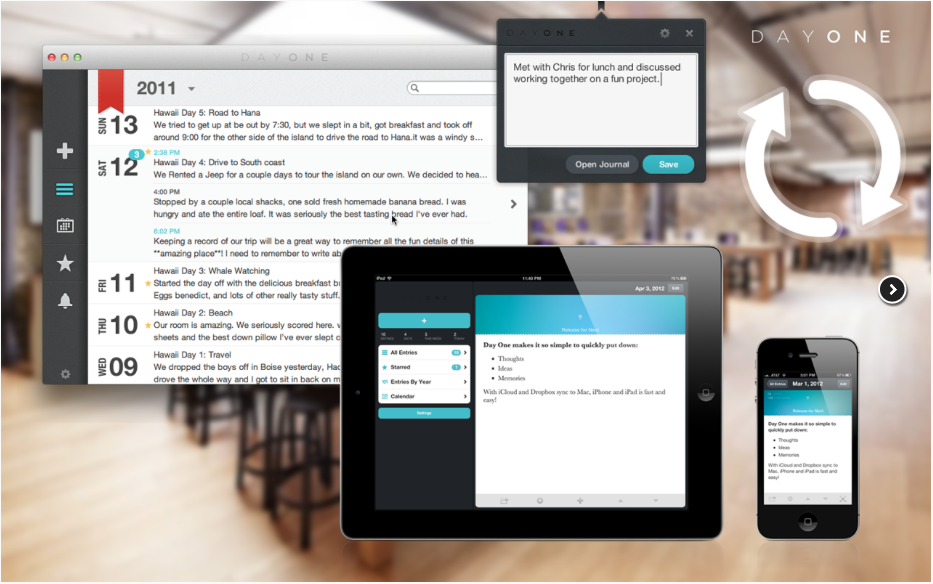
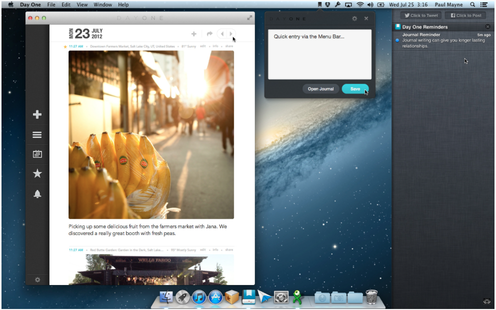
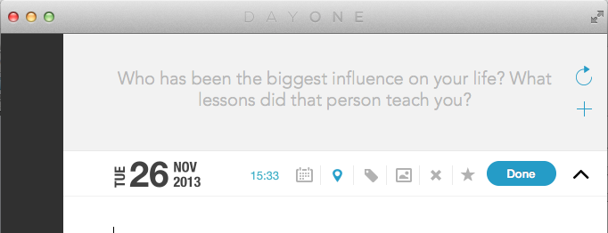
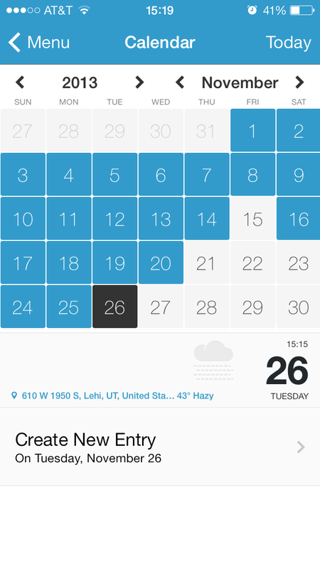
-Ronald C. Schoedel III  Whether your journaling needs are driven by professional requirements or personal uses, Day One has a cross-platform journaling/diary-keeping solution that is convenient, elegant, and easy to use. Day One provided me copies of their Mac and iPad apps for review. For the past three weeks, I’ve been journaling daily–sometimes more than once a day–and have found the experience to be pretty much all I’ve wanted in a journaling app. It’s no wonder to me that Day One was a Mac App Store top app last year. Available both for Mac OS X (updated for Mavericks) and iOS (updated for iOS 7) as a universal iPhone/iPad app, Day One combines a solid writing environment with data tools to give your writing context. Starting an entry automatically date and time stamps it, though this can be edited to be whatever you want it to be. Location and weather data can be added with a single tap, as can be tags, current iTunes track, and for devices with the new motion processor, daily step count, and activity tracking such as whether you were flying, running, or doing other activities. The distraction-free writing environment lets you get down to business, without tons of formatting palettes and toolbars that make writing in a regular word processor somewhat less than optimal for capturing your free-flowing thoughts. The main view shows a snippet of each entry in reverse time order, from top to bottom, newest posts on top. Hovering over the entry lets you see more of the entry without opening it fully. The integrated calendar shows you at a glance the days on which you have journaled, and the days for which you might still need to write an entry. Hovering over a date shows you what you wrote on that date. On iOS devices, the photo view arranges all your entries with attached photos into a full-screen collage with the date of each photo superimposed, for quick reference and enjoyment. On Mac, the maps view allows you to see how many entries you’ve written at each map location you’ve captured in your entries. This could be fun for journaling whilst on holiday, to track your travels visually. The interface as a whole is uncluttered and visually pleasing, in comforting tones of blue, grey, and white. The Mac app contains the option to show writing prompts, useful for those who journal regularly and like to record their thoughts on a wide variety of subjects. For professional users, tags and the built-in search tool make Day One a useful repository for client-specific note taking or project note keeping. Attorneys, for example, could assign tags for client names or types of cases, and easily keep track of the results of meetings and phone calls with clients. The time stamp on note creation can be useful to those who bill their time out, though there is no ending time stamp, so that would have to be noted manually if this were to be your usage scenario. In my three weeks of using Day One, I have found it to sync perfectly across my devices, which has made me more likely to actually keep a journal, something I have tried to do off and on (mostly off) for years. The ability to set a daily reminder to journal is nice for keeping me on target, as is the quick entry feature on the Mac version, which places a Day One icon in the menu bar where you can quickly type an entry (or just a brief thought to finish later) without even launching the full app. Like so many things that my iPhone and iPad have made easier in my life, being able to write (or dictate!) a journal entry whenever and wherever I am when the inspiration arises has been a tremendous boon to my journal-keeping goals. The seamless set-it-and-forget-it iCloud and Dropbox syncing capability makes this possible. I especially enjoy that Day One has given me the ability to remember my random iPhone snapshots in context and make notes on them for future enjoyment. Too often, the casual ability to take photos with our phones results in lots of pics with not a lot of context or remembrance of why they were meaningful to us to begin with. Being able to incorporate those pics quickly and easily into a journal may be the best thing to ever happen to the camera phone. Exporting from Day One to a PDF is also smooth and easy. Perhaps each year you might want to print and bind your journal, and Day One makes this a snap. Emailing a PDF or the text of any entry is also very simple right from within the app, using the standard iOS sharing tools. Suggestions: color-coding entries would be a nice addition, sort of like the colored tags (formerly labels) in Mac OS X. For professional users or individuals who need more privacy, the built-in passcode protection on the Mac app can be gotten around by all but the most casual would-be snoopers. Of course, anytime a third party has physical access to your computer, your data is at some risk of being compromised. But it would be nice if a true encryption option existed rather than app-level password protection, which just prevents the app from being launched without the passcode, while leaving the actual text data files still accessible to those who can find them. For most users, though, the user-account password in OS X should suffice, because theoretically if you don’t want someone accessing your data, you probably don’t want them in your user account to begin with. Also, whilst a single journal entry can be viewed on the map on iOS, the Mac-only map overview of all entries would be nice to see on the iOS app as well. Get the apps here: Day One for Mac $9.99 Day One for iOS (combined iPad/iPhone app) $4.99 - Review by Ronald Schoedel, Esq. By Ronald C Schoedel III Every time Apple releases a new OS X update, I enjoy reading the grand-daddy of reviews published by Ars Technica. Yosemite's review is no exception. 25 pages of insight into the new operating system, with thoughtful commentary. Check it out on Ars Technica here.
-Ronald C. Schoedel III 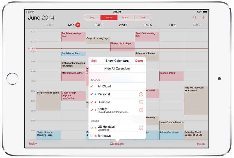 Without a doubt, one of my favorite new features in iOS 8, and by extension, on my Macs, is the new Family Sharing feature. Any lawyer with a busy family life will appreciate being able to shepherd all of her or his family members into a family iCloud scheme, where things "just work."
Initially, iOS was very much individually-based as an operating system. Unlike on a Mac where each user can have his or her own user account, iOS assumed that each device would have one user, who would use her or his own iCloud account for calendaring, purchasing of music, books, and apps, and photo storage. With Family Sharing now, each person still gets to keep their own account, but have it associated with a master account. Getting these associations is as simple as the main accountholder sending invitations right from within the iCloud settings on any iPhone or iPad. Once Family Sharing has been activated, a new shared Family calendar is created (shown above), which all family members have access to edit and view. Individual family members may still share their personal calendars with others, either to view or view/edit, as well, if needed. My wife and I also love the new photo stream sharing. Photo streaming on iOS has been there for quite a while, but the new way brings an elegance that we would expect from Apple. When I or my wife take a photo on our iPhone that we wish to share (or, in our case, provide to the other for use in our journals which we keep in Day One (available here and reviewed last fall here), it's a simple matter of adding that particular photo to a shared photo album, the contents of which get pushed to the other's devices instantly. If you're not on iOS 8 yet, check it out. Family Sharing may be reason enough to get it, for many busy professionals and families. - Ronald C. Schoedel III 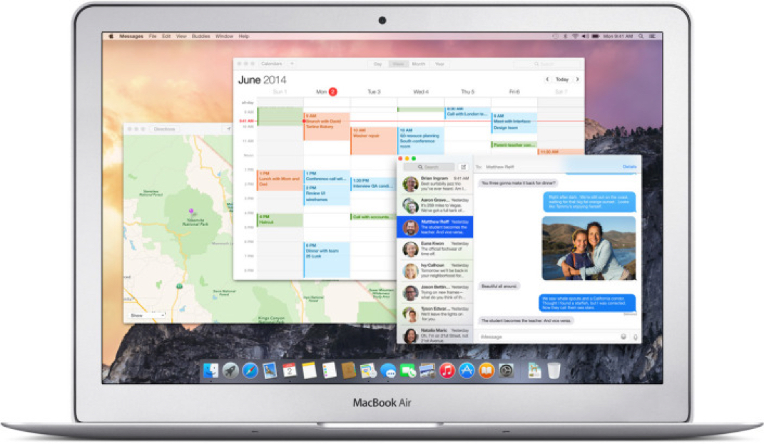 Finally, the silence can be broken! I've been using the Yosemite beta since July, and now that the final version is out, everyone can get their Mac a brand new shiny OS update! (Everyone on 10.6.8 or later, that is.) I'm pleased to report no problems at all have been experienced by yours truly. iCloud Drive is a dream. The new Mail app with Markup makes annotations on files so simple to share with others. The evolution of thd interface seems natural and is not jarring at all. New Spotlight, with its increased search tools extending to the web, makes finding anything a snap. (One complaint: I've loved using Spotlight as a calculator for years. But since it now occupies the middle of the screen, that is hard to do when the numbers for my calculations are on the screen in a document. Oh well.) Handoff and Continuity are the two big features I've been waiting for. iOS 8.1 drops on Monday; you'll need it to gain the maximum increased interaction between iOS and Mac devices. I'll be writing a few short blurbs on cool new things in Yosemite as I discover them and discover their application to my workflow. For now, go forth and fearlessly update. The future is bright with this latest OS X release. - Ronald C. Schoedel III
To begin with, MailMate is not the most beautiful email app, aesthetically speaking. It doesn't have any pretty icons or colorful interface elements, but instead carries a basic chrome interface and nearly all text-based buttons. There's good reason for this: MailMate is a keyboard centric email management system, which means it saves you time if you take a few minutes to review it's extensive keyboard command set. If you are super busy and like to get through your email quickly, or if you have to process metric tonnes of email every day, the quite beautiful icon for Mailmate gives us a hint as to its strength: carting in all your mail, sorting it in its virtual mail room, prioritizing it for your viewing or just stacking it up and setting it aside for later, and then getting all your outgoing messages on their way, on your schedule (with a built-in send-later features). Also, unlike most every other email app, MailMate offers full offline support, even for creating or deleting IMAP mailboxes. Users of web-based clients cannot work through their email inbox whilst in flight, for example, whereas true offline support lets you do everything except send and receive messages, which obviously requires an internet connection. In my decade plus of tech training and consulting, I have met many people who have a hard time taming their inbox, partly due to the number of subscriptions they have, such as to Listservs, which--whilst offering access to lots of useful information and conversation--can often be the source of getting so far behind on reading through one's inbox. MailMate offers the ability to selectively "mute" conversations. Don't need to read everything on a Listserv but don't want to unsubscribe? Take a quick glance at the subject or the first message in the thread, and mute it if you don't want to follow it. You'll still get all the subsequent messages, which can be automatically tagged and filed into smart mailboxes, but you won't see them show up in the unread count in your inbox. If a large numeral glaring through the email count badge has ever caused you stress, you are not alone. This seemingly simple answer to taming mailing list subscriptions will add a new level of calm to your email life. On a side note, when I first added my accounts to MailMate, it created some smart mailboxes for some of my subscriptions automatically. That was a pleasant surprise. The smart mailboxes feature in MailMate far surpasses any I have seen, with its deep filtering and searching ability into such header fields as unquoted text or quoted body text. If there's a header field in an email, I'm pretty sure MailMate supports filtering by it. Combine that with the power of true Boolean logic and your smart mailboxes can do more than you might have imagined. MailMate comes pre-populated with a dozen or so smart mailboxes, which whilst useful on their own, more or less serve as guides on how to create others customized to your uses. Which leads me to mention the manual. Unlike a lot of modern software, MailMate has an extensive manual available online and through the Help menu, with tips also built into the app which can be set to show up every day, in an unobtrusive little bar at the bottom of the main window. For those who want to go the extra mile in their email management, MailMate supports custom keybindings, though I have not yet done much in that area. MailMate may not be for everyone, though for those who rely on email to get a lot of things done, MailMate could be exactly what you are looking for. It is lean, super fast, and incredibly powerful, and at a cost of only $50, a solid software investment in your own productivity. A 30-day trial period is available at no charge. * Shortly after I published this review with a screenshot I blurred for privacy, Benny, MailMate's programmer, emailed to tell me of the Distortion Mode available under the View Menu. If you need to do screenshots in your email, they will look nice, as below! Get it here: http://freron.com -Ronald C. Schoedel III 
Perhaps my favorite feature, however, is the very attractive Summarize view when replying to emails. How I tire of trying to decipher who said what in a dozens-long email chain, with the text squeezed into a tiny column by all of the preceding forwarding marks. Postbox replaces this:  with this:  Not hard to see which makes better sense of messages. If you’ve ever lost an attachment, you’ll appreciate Postbox’s icon view, which takes an email folder and shows all of the images attached to messages within that folder, giving you access to save or forward those attachments. Never lose another emailed photo again!  And, posting to Facebook or Linkedin, as well as Tweeting, has never been easier, if you tend to “live” in your email program (as many do): 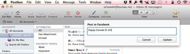 Perhaps the most automated feature is Postbox’s tight integration with Evernote. I love Evernote and use it to track pretty much everything in my personal and work lives, so when Postbox — with the click of a single icon — can take an email, turn it into an Evernote note, turn the subject of the email into the title of the note, and turn the email’s topics into Evernote tags, I think that’s pretty dang spiffy. Postbox adds all of these innovations all whilst keeping the interface lean, attractive, and uncluttered. The Focus pane helps you squeeze more useful information into your widescreen view of your mailbox, adding quick sorting by topic, sender, and filters such as attachments or unread. Keyboard shortcuts to add Topics or Labels to your messages make it a breeze to sort messages as you read them. Read a message, apply a Topic, and then onward to the next message, and so forth. If you deal with large volumes of email on a daily basis, or need to whip your inbox into shape, this is a fast and efficient way to get a handle on what your emails are all about, and then narrow your focus and tackle one topic or concern at a time. Sending Dropbox links is also a breeze. Instead of cluttering up your recipient’s inbox with huge attachments, and risking returned mail because of too-large attachments, dragging and dropping files from your Dropbox folder results in links within your message, by which your recipient can easily click and download the file, with the added advantage of always having the latest revisions to the file easily available. I should also mention how easy it is to make a nice signature in Postbox. Using basic HTML (instead of sending an image file embedded in my mail), all of my messages bear this signature: 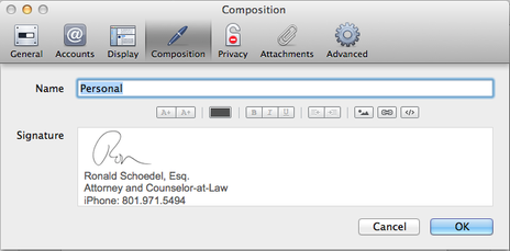 I have been using Postbox for a few weeks now and am only truly beginning to understand just how much power its got under it’s mailbox-shaped hood. I love finding new ways to use my Mac to make me more productive and efficient, and Postbox has allowed me to shave a lot of time off the time I generally spend handling email. Even if you save just a few minutes a day, it’s $9.95 price tag is so worth it. If you feel like OS X Mail is close, but not quite, what you’re looking for, the upgrade to Postbox 3 will get you what you want, and much more. I highly recommend Postbox for anyone who uses email.
Get Postbox 3 here: http://www.postbox-inc.com - Ronald C. Schoedel III  For Gmail fans on the Mac—especially for those with multiple Gmail accounts—there is no better choice than Mailplane 3, to integrate the best features of Gmail with useful operating system integration that makes working on the Mac so productive. Typically, webmail services have two major shortcomings: you can only be logged into one of the same account type at a time (e.g., only one Gmail account at a time) and they are usually left out of interoperability with system-level functions such as using the OS X Contacts app, sending files from the Finder, mailing PDFs from the Print dialog box, true OS-level QuickLook functionality for previewing attachments, and accessibility to Apple Script functions. Because webmail accounts typically live inside a web page, loaded within a web browser more or less like any other page, they are isolated from the system and must be interacted with solely from within the web browser. Mailplane solves these problems and brings the power and ubiquity of Gmail to the integration with Mac OS X that non-webmail accounts, or webmail accounts loaded in to a typical Mail client (like OS X Mail, or Eudora of old, etc., or either of the other two modern mail apps I’ll be shortly reviewing) have enjoyed. If you’re like many folks, you’ve quite possibly got a personal Gmail account or two and a work Gmail account with a custom domain. If you’ve been using only browser-based email, you’ve likely been logging into one, doing your email within that account, logging out, logging into another…lather, rinse, repeat. Wouldn’t it be nice if you could fire up one app (especially an app with a snazzy icon!) and have a tabbed interface, just like a browser, but with each of your Gmail accounts and their respective calendars occupying a unique tab that you can easily switch between without any logging in or logging out, ever? That is, at the very minimum, what Mailplane can do for you. I’ve been using Mailplane with three Gmail accounts: one personal, one work, and one using the custom domain of my alma mater. In my mind, one of the things (aside from massive free storage) that sets Gmail apart from the other webmail providers is a keyboard-centric user interface that really shines for power users. But the downside is not being able to keep two accounts active at once. With Mailplane, I can use keyboard shortcuts to advance between messages, apply labels to messages, archive them, and then zip over to the other accounts and do the same. The preferences also contain the ability to record your own keyboard shortcuts, providing an extra level of customization. And, because Mailplane is integrated into OS X instead of just being a browser, its icon in the dock as well as the application switcher (command-tab) shows the unread message count with a red badge, as the stock Mail app does in OS X. The unread message count also shows up as a badge on each account’s tab. Speaking of notifications, a menu bar notifier as well as integration with OS X’s Notification Center are also available within the preferences of Mailplane, and those notifications can be turned on account by account, rather than universally. Use one account primarily for spam/subscriptions? Turn of the notifications and just see those messages when you choose to, not being bothered by badges and notifications. One of Mailplane’s cleverest features is the ability to edit attachments you’ve received (such as PDFs for signature) and then turn around and email the edited version back, with just a few mouse clicks. This can be a real workflow time saver, freeing you from first saving a file, opening it, editing it, saving it again, locating it on your hard drive, and sending it back. As with OS X’s Mail.app, you can also drag and drop a file icon on the Mailplane app icon in your dock to attach a file to a new message, something that is impossible with the web client. And if all that wasn’t enough, if you never use GChat or Google Plus, you can suppress those functions, as well as block Gmail ads from showing up within the app window. It’s the best of Gmail whilst cutting out the annoyances. The same productivity tools that Mailplane providers for Gmail are also available to your Gmail calendar, which can reside in its own tab within Mailplane, again for multiple accounts if that is your need. If you are a fan of Gmail and Google’s approach to email, but wish for better integration with your Mac, Mailplane is the way to go. At only $24.95, it’s a small price to pay for a huge productivity boost. I highly recommend Mailplane for power Gmail users on Mac OS X. A 15-day free trial period is offered. Get Mailplane here: http://mailplaneapp.com - Ronald C. Schoedel III   Calendars 5 is the latest iPhone and iPad calendar app from Readdle, the same folks who brought us PDF Expert, which I recently reviewed here on iLegalPad.com. Calendars 5 is a universal app, meaning it works on both iPad and iPhone, with just one purchase ($6.99 on the App Store). I used Calendars 5 on both my iPhone and my iPad for a few weeks and what impresses me overall is the attention to detail paid by Calendar 5’s designers, who have added subtle touches that make it intuitive and easy to use, in all of its various views and on both types of devices, as well as its integration of tasks and appointments into one application. Calendars 5 works with iCloud and Google calendars, and works just fine with the five calendars I synced with it. Of course, you can choose to display or hide calendars on an as needed basis. Calendars 5 makes very good use of the iPhone 5 screen area, and offers a list view of your daily appointments something like the iOS Calendar app used to offer until iOS 7’s redesign. Lots of folk I know loved the list view; with Calendars 5, you can have it back, and in a visually intuitive form that shows color coding for each event to match the calendar, as well as a “slider” at the bottom of the scree showing your position in the current week, for reference. Daily, weekly, and monthly views provide detail and bird-eye views of your calendar, as needed. Whilst the iPhone version provides a number of advantages over the native iOS 7 calendar app (some of which will be mentioned shortly), my favorite iteration of Calendars 5 is on the iPad, where it really has room to shine thanks to the large screen format. I love the day view, which shows a rolling list along the left side, and the hourly calendar on the right, along with the current time displayed as a line across the timeline. Individual events show the scheduled time (e.g., under my event entitled “Work”, the blue event box also shows the times scheduled, 8:00 - 17:00). Recurring events display a small circular arrow within the event box, providing an immediate visual cue. A date slider along the bottom of the screen shows two weeks worth of dates between which you slide. On the iPhone, the list and day views are separate due to the limited screen area. The week view on both the iPad and the iPhone cleverly indicate that events are scheduled before or after the actively visible screen area with little arrow icons in the color of the calendar on which events are scheduled, to make sure you don’t overlook something that is scheduled later in the day. In the same manner as the day view, the week view has a slider across the bottom through which you can scroll through the weeks and choose which one to view. Ditto for the month and year views. The month view looks fairly similar to the native iOS app, but the year view shows each day color coded as to how busy it is: white for days with nothing scheduled, yellow, orange, and red for progressively busier days. This is great to get a bird’s eye view of the year and see when you’re booked out, at a glance. My absolutely favorite feature is the natural language input method employed (optional to use). Don’t get me wrong: I think the sliders and wheel metaphors in iOS are great and handy and all. But sometimes it’s easier to just type “Meet Jim at Paradise Bakery tomorrow at 13:00” and have it automatically know the date, time, and location, as well as the title of the event. If you’re a fast typist, this may be the easiest way to add an event to the calendar--much the way that advanced typists can do with their keyboard using shortcuts a task for which many would prefer a mouse. Of course, dictation (on those devices supporting it) works as well, so you can just speak your event into existence. The task list integrates with iCloud’s Reminders, so you can stay synced between your iDevices and your Mac’s Reminder list. The primary advantage is that both tasks and calendar events show up in one app, giving you an idea of how busy your day is, when you’ve got due dates assigned to your reminders or tasks. Other intuitive features include drag and drop for events and tasks, the ability to send SMS reminders and custom alerts for events. Event invitations can be sent from within Calendars 5 as well. Calendars 5 has a nice, iOS 7-inspired design that looks sharp and crisp. I am a fan and enjoy using it daily. You will too. Get it here: Calendars 5 for iPhone and iPad by Readdle 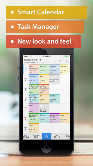  Ever since I became a happy iPad owner, I've been on the lookout for an app that could approximate the same PDF reading, annotating, and markup features I've become accustomed to on my Mac. I've tried a lot, and found some come close, but until PDF Expert 5, I always felt something was missing. Readdle's PDF Expert 5 ($9.99 on the App Store) introduces some quite innovative features not seen before on iOS, and others that have never before been available at such a price point. Among the most interesting features are the ability to directly edit text in a PDF file, much like you would in a word processing document. Underlining, highlighting, shape-drawing are all there as well. The free-form editing tools are intuitive, powerful, and make PDF editing on-the-go effortless. In our digital age many documents come to us needing a signature with a request to email them back to their sender. Some folks still print these out, sign them, scan them, and email them back. PDF Expert allows you to sign a PDF directly, either with your own stored signature or a new signature, perhaps that of a client or customer. This is the sort of workflow improvement that can save most people lots of time and hassle. A three step process (print, sign, scan) is reduced to one step: tap and hold on the screen to insert signature. PDF Expert could be useful to share draft documents back and forth between colleagues for review, with the ability to enter comments and notes, highlight or circle portions, or suggest new text. There are a number of stamps available, such as x's and tick marks and "DRAFT", "FOR REVIEW", and so forth, as well the built-in facility to create your own stamps. A "Preview" mode shows exactly what the document will look like with your changes incorporated, whilst the "Markup" view mode shows the changes. Filling in forms could not be easier. Where other apps only allow text entry in discrete data entry fields that have been so-designated by the form creator, PDF Expert solves the problem we've all encountered from time to time: PDF forms where the data entry field is obscured, too small, malformed, or otherwise not suitable for input. PDF Expert allows you to tap and type anywhere on the document, and you can easily adjust font and font size for entered text. If a form gives you a too-small box in which to write your name, you can easily decrease the text size till it fits, which most PDF forms do not allow you to do. PDF Expert also expertly handles standard form fields and calculations where the document has enabled such, as well as date and time entry. PDF Expert has become my go-to app for PDF form filling. Getting documents into and out of PDF Expert is super easy. It interfaces with most major cloud storage services such as Dropbox, Box, Office 365, Skydrive, and many more. When you've got the document the way you need it for good, PDF Expert makes it easy to flatten it (apply all the form data, markups, and signatures permanently) and get the document where it needs to be. You can save a copy of the altered document, keep it stored in PDF Expert, which has full file management capabilities, email a copy, print, or open it in other supporting apps on your iPad. Among PDF Experts neat tricks are the incorporation of audio playback of text. Have your document read to you aloud, whether its a legal brief, a report, or an ebook in PDF format. You can directly control the reading speed and designate the language of the text: many are available, including Arabic, Chinese, French, Japanese, Russian, and dozens more. I love this feature. And much like Apple's iBooks app, PDF Expert can format PDFs for viewing in either sepia or nighttime mode, which can be very useful to make long documents easier on the eyes than reading 100 pages straight of black on white. Another neat feature is the ability to create bookmarks, and build a table of contents in your PDF documents right within PDF Expert, meaning that PDF Expert can be a very powerful editing tool to finish up documents. Pages can also be rearranged quickly and easily. PDF Expert comes with a complete user guide, nearly 50 pages long, explaining how to use each feature, though most features are quite apparent without the need to study the documentation. I've got a few other PDF reader-editor apps on my iPad, but after just a few weeks making PDF Expert 5 part of my workflow, the Adobe Reader app is getting awfully lonely. In summary, PDF Expert 5 brings desktop-class editing tools to a mobile app at an unparalleled price. Sure, you could spend $200 on Acrobat Pro for your computer, or you could spend $10 for probably the most-used 80% of its features that are present in PDF Expert on iOS. PDF Expert is iOS 7 compatible and has been redesigned to neatly match the iOS 7 aesthetic. Get it here: PDF Expert 5  iBank 5 was released last month as the latest entry into the Mac personal finance software world. iBank 5 is a strong follow up to the previous versions, and with a companion iPad app, is a mature, stable money-management platform for any Mac and iPad user.
iBank had its beginnings in a post-Mac OS Classic world in which Quicken had all but become abandonware on the Mac, with Intuit leaving the market wide open for a bright newcomer to move in. IGG rose to the occasion and with each successive release of iBank has gotten only better. iBank 5 builds on its past successes (including an Apple Design Award) and offers features that allow it to breeze past its competition. If you are a current iBank user, iBank 5 adds a number of compelling features to complete your experience. If you are using Quicken Essentials, iBank 5 is such a huge leap ahead in functions and features, you'll hardly believe it. Upgrades from version 4 are half-price ($30, purchased through the software itself), a nice reward for faithful iBank users, but even at full price of $60, it’s a great deal. Now, all inside one window and one app, you can manage your checkbook, investment accounts, credit cards, download banking statements and data, and pay bills online, while also offering check printing capabilities. If you connect to your bank by OFX, you can pay your bills directly from within iBank 5, which is very cool! Other new features include improved handling of scheduled transactions, with reminders to help you never miss a payment. Back in the “old days” I used to write a bunch of checks and keep them, along with addressed envelopes, in a folder and mark on my calendar when to mail each one of them. iBank 5 allows me to use the same concept by allowing me to schedule payments in advance, and then remind me in time to send them (either by sending online or printing the check) and enter them. As a big fan of organization and planning ahead, this feature suits me well. Many folks have lately adopted the envelope method of budgeting that has been promoted by financial gurus in recent years. Envelope budgeting has long been my favored method. Envelope budgeting is used by first setting up a budget through iBank’s setup assistant and creating categories that correspond to envelopes of your choice, then creating virtual envelopes and funding them with existing cash or scheduled deposits from future paychecks. Then, when you get paid, money will automatically go into your virtual envelopes, and when you spend money and enter the transactions with the appropriate category information, money is automatically removed from the corresponding envelope. You can see, through detailed bar graphs, how much of your money is left and how much has been spent from your envelopes. iBank has incorporated envelope budgeting in an easy to use manner, which very much replicates the simplicity and visual appeal of the envelope method of budgeting. If you’re the sort who loves to keep data synced across your Mac and iPad, the combo of iBank 5 and iBank for iPad along with IGG’s Direct Access service (by subscription) keeps all your banks’ downloads updated constantly and across all devices (fixing what I found to be a shortcoming in the former version when I reviewed iBank for iPad last year). If your bank is one of the very few that doesn’t support Direct Access or OFX—or if you just prefer to do it manually and not pay for the Direct Access service—you can use the integrated browser to download your banking data directly into your account files. This simplifies the process, which previously would involve going into your web browser, downloading the file, finding the file in your downloads folder, and importing it into your finance app. iBank simplifies that substantially. Part of any serious financial management is reporting and analyzing data to find trends, spot problems, and plan better for the future. iBank’s reporting tools are capable and I appreciate how reports are generated in a format that prints easy, yet also is viewed within the app window. Building a budget is an easy process, which iBank conveniently walks you through, setting up the different income schedules you might have, recurring bills, and also allowing budgeting for one-time or sporadic expenses. Aside from these new or improved features, all the usual needs are met in a finance app as well: a familiar register view, which allows for categorization and subcategorization of expenses, split transactions, and account reconciliation. I’ve not started on my taxes yet, but iBank very easily prepared a report with all my taxable transactions and deductible expenses. TurboTax export is also available for fans of that software. Though I do love iBank 5 and its new features, I was sorry to see that the new design aesthetic in iBank 5 has removed almost all color from the majority of the interface. I was also disappointed when Apple went to monochromatic Finder sidebar and Home folder icons, as well. I realize that iBank has just followed Apple’s own lead to smooth out and flatten the interface a bit, but I really liked the colorful icons in iBank of old. I also miss the coverflow view of transactions (yes, I also complained when iTunes got rid of coverflow). I’d love it if iBank could provide an option for colored icons in the source list (accounts, reports, etc.). Oh well. The individual transaction icons are still colorful, even if not cover-flowable anymore. In the end though, these are minor details, that don’t really detract from the functions and usefulness. For anyone who wants to manage their personal finances, including cash, bank accounts, credit cards, investment accounts, and budgets, iBank is a solid choice, and one that I can easily and happily recommend. The video tutorials and user guide available provide a level of support that a lot of software developers have forgone in recent years, which is a nice touch, and adds to the user’s confidence that iBank will be around for a while and that its developers care about the software and its user base. Get it here: iBank 5 iBank for iPad  In all the years Microsoft has produced Office for the Mac, they've completely left out OneNote, which has become the standard for note taking for Windows Office users for years. Mac users have been hoping for something similar. Whilst other note taking apps exist, and some of them are quite good, there has never been--aside from virtualization--a way for a Mac user to sync with OneNote notebooks used on a work PC, for example.
Now, merry Christmas to all of us, here comes Outline for Mac, bringing with it a capable, beautiful platform for note taking on Mac and iPad, with OneNote compatibility. You don't need OneNote to use or enjoy Outline. But if you've struggled to get along without OneNote on your Mac, this is definitely your lucky day. At only $39.99 Outline is an outstanding and bargain-priced app for comprehensive note taking and organization. So whether you're a Mac-using OneNote devotee or you're looking for a productivity-enhancing note-taking system, Outline has your solution. I've previously reviewed both the Outline reader for Mac and Outline+ for iPad, and given them my stamp of approval. In the past 24 hours of using the pre-release version of Outline for Mac (the release version went live today on the Mac App Store), I can say that my enthusiasm remains strong. Note taking on the Mac just got amazing. Get it here: Outline for Mac Outline+ for iPad  As you may have heard, Apple has released the latest version of its Mac operating system: OS X 10.9 Mavericks. I have spent the last couple days playing around with some of the new features, and one of my favorites is called Enhanced Dictation. As you also may know, last year Apple introduced dictation in both iOS 6 and OS X Mountain Lion. It did not take long for me to become a huge fan of both. Now, I most frequently dictate e-mails, rather than type them. I have generally found the dictation feature to be highly accurate and very convenient. My only complaint about the feature was that it required a persistent Internet connection, in order to transmit speech to an Apple server and then receive the words back in typed form. This generally happened quite quickly, within a second or so. It was never a question of the time it took to convert the spoken word into typed words, only a question of whether an Internet connection was available. On an iPad without cellular Internet service, or for a MacBook (period), it meant only being able to dictate where Wi-Fi network was available. When using the online service, one also is limited to about 30 seconds of dictation at a time. The latest incarnation of Mac OS X removes this stumbling block to dictation. Now, with a download of less than 800 MB, dictation is available on a MacBook or a desktop Mac anytime, anywhere. And best of all, since Mac OS X10.9 Mavericks is available for free, enhanced dictation is free. What used to cost hundreds of dollars for third-party software, is now available to anyone with a Mac capable of supporting OS X 10.9, which means pretty much any Mac purchased in the last six years. Enhanced Dictation lets you speak continuously with the words appearing before your very eyes. Anywhere you can type, you can dictate. The service is very smart about capitalization and to enter punctuation, you just speak the name of the punctuation mark you want. So, for example speaking quote I love ice cream period unquote produces "I love ice cream." Apple has truly been at it again: providing new value and adding features to years-old hardware. There are many reasons why you might want to update to Mac OS X 10.9 Mavericks, but not as many of them are as obviously useful for an attorney as enhanced dictation. If you skipped any of the recent Mac OS X updates, you are in luck. OS X 10.9 Mavericks is free to any Mac owner who is using 10.6 Snow Leopard or later. PS: this entire blog post was done with dictation. Get it here: OS X 10.9 Mavericks on the Mac App Store (FREE) 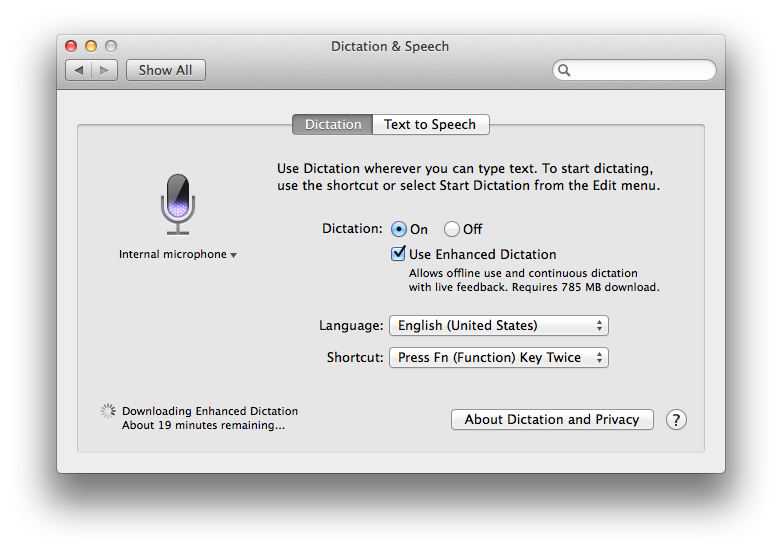
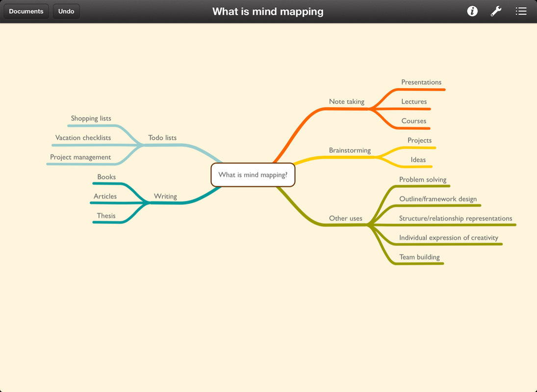
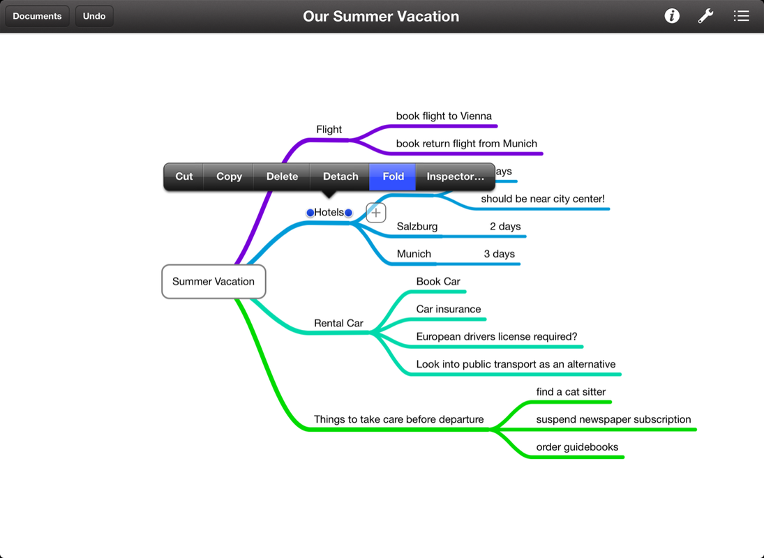
Double Robotics has released its Double Telepresence Robot for Telecommuters, promising owners the ability to have a presence in the office even whilst telecommuting. Watching the video from Double is fun, and the photos make it look pretty cool, too. The idea looks fun, but I have to wonder what it would be like to be working in an office where robots approach you routinely to teleconference with their alter-ago. Perhaps some day these will allow attorneys to make it quickly from one hearing to another in record time: You could go live to deposition A, and send your robot to hearing B. "Thank you, your honor. Ronald Schoedel, by robot, appearing for plaintiff." I want one. Review of Double Robotics Double teleconferencing robot, with video.  Brainstorming has been considered an effective technique for collaboration, getting ideas out of one's mind or a groups' minds, and into a format that can be analyzed, expounded upon, and subjected to a critical process, with the end goal of finding the best ideas and acting upon them. Mind mapping is a concept that originated a few decades ago, and has since come to the fore of productivity enhancement techniques. If you are not familiar with mind mapping, it consists of a visual representation of the relationships between ideas. A mind map is started with a single idea which becomes a node to which appendage ideas are connected. As the thought process flows, additional ideas are linked together through nodes, subsides, and with color or text style sometimes serving to differentiate trains of thought. Studies have suggested that mind mapping can be a more effective means of note taking for students, as well as planning, decision making, problem solving, and information gathering/organizing. With such a method being so popular and effective, it only makes sense to bring it to the iPad and Mac, which IdeasOnCanvas GmbH, out of Austria, has done with their MindNode Pro and MindNode Touch apps (hereafter, collectively MindNode). MindNode is available for Mac and iOS (both iPad and iPhone), and all versions interact with each other and can edit mind maps created with the other version. Dropbox and iCloud synchronization is available within MindNode Pro, so that whatever device you have available, you can use your documents. For example, in a study group session or a meeting setting, you might put your mind map on the projector screen from your MacBook, allowing collaboration, and then saving it all to iCloud for later reference and editing from your mobile devices. I found the syncing to work exactly as expected, just as reliably as any Apple app uses iCloud, such as Pages or Numbers. It just works. The software itself is polished and intuitive. It has relatively few controls, making it very easy to get right into and pick up the methodology of mind mapping, even if you've never done a hand-written mind map before. Main nodes are initiated with a simple click, and then branching off is as simple as dragging out from the main node in the direction you want to go. A smart layout mode is available to organize branches, or you can go free form and drag your ideas anywhere onto the page. Sometimes, after you've got a few ideas on the page and many sub-nodes, you will have occasion to identify connections between ideas that exist within separate trees. Connecting these ideas is quite simple, and provides a visually uncluttered way of acknowledging and organizing relationships in the thoughts you've mapped. The programs' specifications say that the canvas size is unlimited. The ability to collapse and expand nodes as needed helps keep your map tidy when it begins to get expansive. Colors and fonts are all customizable, but there are also several pre-programmed color schemes that are attractive. Media can be added to a mind map very easily, such as photographs, to add further visual impact to your maps. The flexibility of the software and the method by which the interface just allows your ideas to shine and take center stage really sets MindNode apart from other mind mapping apps I have tried and gotten frustrated with. The keys of good software design is to let the application sort of fade out of view so that the creative work being done is not obscured by buttons, widgets, controls, menus, and so forth. MindNode Pro's exceptionally clean design (across both versions, Mac and iOS) has made me enjoy mind mapping on the computer and iPad, something that a number of cheaper or free programs has not done. In my use of the apps, I never encountered a single problem or difficulty either in execution of what I wanted to do, or in the results. I'm a big fan of being able to use the same apps across all my devices, and MindNode indulges this need of what I believe is a pretty large group of users. The interface in iOS is optimized for the touch screen, so it's pleasant to use MindNode across platforms, which is often note the case (many mobile apps have been ported from the desktop without much thought given to optimization for a touch interface). Once you've used either the iOS or Mac version, picking up the other without any training is quite possible, but there is a helpful manual and support website available. Just as important as getting your ideas into the app, and organized, can be the need of getting your ideas out of your computer or iPad onto paper, or into another application for further collaboration. MindNode offers numerous exports, including formats such as PDF and images, but also text (into outline form), and FreeMind and OPML, which is useful for outlining apps such as Omni Outliner. In my tests, mind maps exported into OPML opened perfectly in OmniOutliner, with all data present and organized as a traditional outline. On the iOS version, a handy textual outline view is available. Exporting on the iOS version allows you to save a mind map to your camera roll, or export to another app via the same formats the desktop version supports (of course, using an easy touch interface). It is nice to see an app that exhibits so much thought put into the porting process from desktop to touch. As Mac and iOS users, as we know, it's the little things Whatever your purpose may be in mind mapping, MindNode Pro provides the canvas for your ideas to bear fruit. I heartily recommend MindNode Pro without any reservations at all. There are no downsides or cons to the apps or to the MindNode ecosystem. Get it here: MindNode Pro (Mac) MindNode Touch (iOS devices) (same app works on iPhone/iPod touch and iPad) 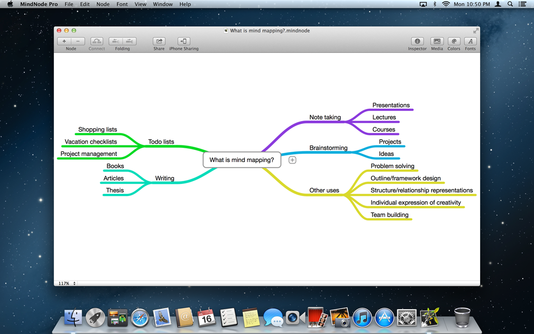
 We live in a world of information overload. Sometimes our jobs require us to read so much information every day, there seems little time to do anything else. How nice would it be to take a bunch of documents you need to read, and have them converted into an audio file that you can listen to whilst in the car, or anywhere else you might want to listen to your iPod or iPhone (or other music player)? Mac OS X has a nifty programming environment called Automator, which allows users to drag and drop actions into sequence to create applications or workflows that can automate a lot of tasks, making your life simpler. All sorts of routine tasks can be combined into sophisticated sequences. I have designed workflows that combine PDF files, batch rename files, convert batches of files, and the subject of this post, convert a Word document into an MP3 file that you can listen to. To get started, download the file below. Open it on your Mac, and then, open a Word document as well. Press "Run" from the upper right corner of the Automator window, and in a few seconds you will have an audio reading of your Word document in a playlist in iTunes, ready to be synced to your iPod or iPhone. If you'd rather not download the pre-assembled workflow--so you can try your hand at building it yourself, just follow the outline below: 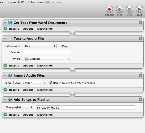 You can experiment a bit and find many other uses for this workflow, aside from reading briefs, pleadings, or other Word documents you might have to read. See a bunch of article online you want to read but haven't got time for? Safari has an excellent feature called "Reader" which, when invoked, presents you with a view of just the webpage's text, unencumbered by ads, links, and other junk. You could copy and paste a bunch of articles from Reader into a Word document, run the workflow, and have all your news articles of interest compiled into a handy audio file to listen to on the drive to work. To invoke Reader in Safari, look for the blue box at the right side of the URL bar that says "Reader", and click it, which will give you the view below: 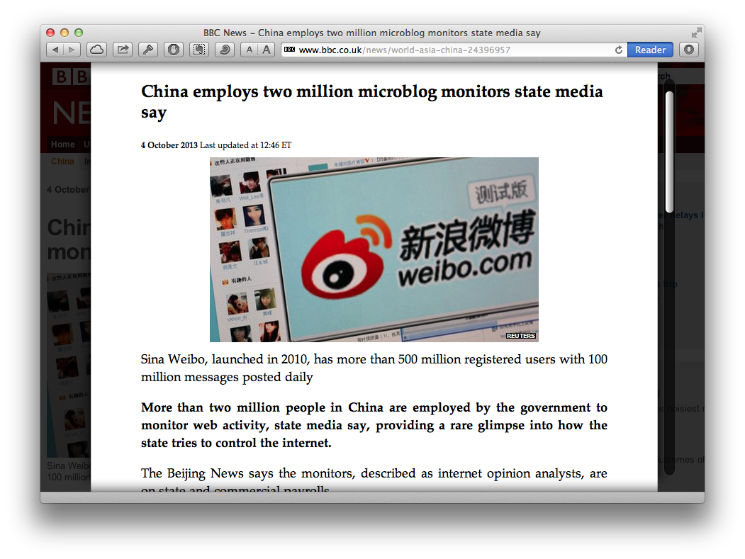 I like loading a bunch of BBC articles into a document, then having them read to me by one of the British voices that you can download for free within OS X (You can browse the available voices, and download dozens more in many languages, free, in the Speech and Dictation pane within System Preferences.)
Get it here: Word Document Text to Speech Automator Workflow - Ronald C. Schoedel III, Esq.  Copy.com is one of the latest entrants to the increasingly competitive consumer-oriented cloud data storage market. If you are familiar with Dropbox, you will be instantly familiar with Copy. I've been a Dropbox user for a few years now, and have also been a very happy Copy user, for the past several months. I use both services, each for different purposes, and I submit that even if you have a Dropbox account, you, too might find a place in your workflow for Copy.com. Copy combines a web interface, an iOS app, and a Mac app (as well as Linux, Android, and Windows versions) to make all of your stored documents available across any device you might have access to at any given time. I am using Copy to make files from my Documents, Downloads, and Desktop folders on my Mac available to me anytime on my iPhone and iPad, as long as I have internet access. This has proven quite useful when I am away from my computer, on the phone with someone whilst I am out and about, and I want to refer to a document for some information. I simply pull up the Copy app on my iOS device, navigate my folder structure which mirrors that on my Mac, and download the file. The Copy app has a built-in file viewer so I can read most any sort of file. Pages, Numbers, text files, Word, Excel, PDF, images, and others are all readable within the app. For other sorts of files, the "Open in..." function allows you to send your document to other apps on your iPad or iPhone. Among the other useful features of Copy are its Shared folder, which allows files to be shared amongst Copy users for collaboration or multiple user access, the ability to restore files from multiple previous versions (I counted at least 20 prior versions available to me when I accidentally deleted a file the other day), and significantly better pricing than Dropbox: your first 15 GB are free, compared to Dropbox, which gives you 2 GB free. Use this link, and get an extra 5 GB free after you sign up and install the Copy app on at least one device. Whether you're looking for backup in the cloud, or file syncing across devices, Copy is a compelling new service that will give Dropbox, SkyDrive, and Google Drive a run for their money. Get it here: Copy.com Review by Ronald C. Schoedel III, Esq. 
|
AuthorRonald C. Schoedel III is an attorney, former broadcaster, student of Welsh, and Sinophile. He has lived in Alaska, Wales, and China (Hong Kong specifically), and presently calls Utah home. He has been teaching and training Mac users for nearly a decade, and started blogging as a software reviewer in 2004. Archives
September 2015
Categories
All
|

 RSS Feed
